

ACRE
Places of Possibility
ACRE
Places of Possibility
ACRE
Places of Possibility

ACRE represents a comprehensive rebranding initiative undertaken for General Office Products (GOP), a long-standing leader in the Minneapolis and St. Paul workspace design scene. Tasked by Devise Agency to modernize GOP's brand voice and visual identity in a competitive market, this project focused on creating a fresh and impactful brand that reflects their expertise in crafting dynamic work environments. The resulting ACRE brand identity draws inspiration from the fundamental concept of an acre, reimagining it as a foundation for creating diverse and unique spaces while subtly communicating a commitment to sustainability and modern design principles.
Process
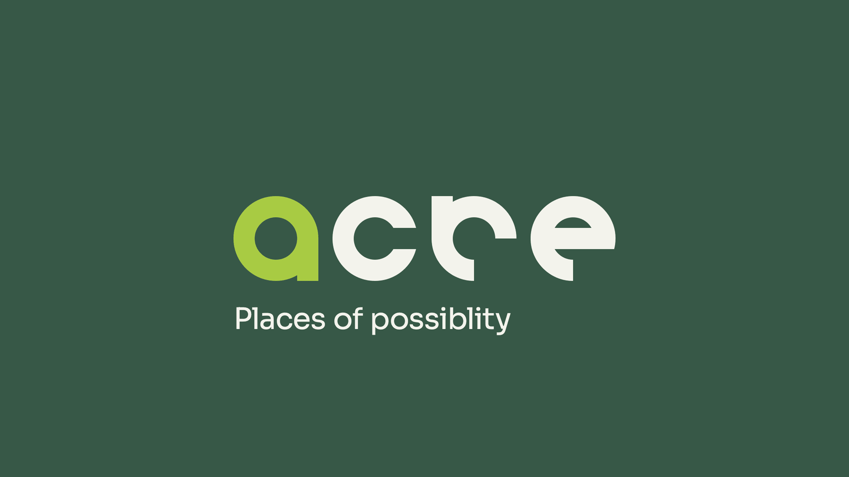
The rebranding of General Office Products, aptly named ACRE, began with the challenge of modernizing a long-established company while retaining its core expertise in workspace design. The process involved a strategic exploration of the concept of "acre" itself, not just as a unit of measurement, but as a foundation for diverse and unique environments. This led to the innovative logo concept, which cleverly reimagines the idea of a square acre through the use of circles. Each letterform within "ACRE" was uniquely crafted by manipulating these circular shapes, visually representing the creation of varied and distinct working spaces from a common ground. The color palette was carefully selected, drawing inspiration from earth tones to reinforce the "acre" concept and subtly communicate a commitment to environmental consciousness and sustainability.
Process
The rebranding of General Office Products, aptly named ACRE, began with the challenge of modernizing a long-established company while retaining its core expertise in workspace design. The process involved a strategic exploration of the concept of "acre" itself, not just as a unit of measurement, but as a foundation for diverse and unique environments. This led to the innovative logo concept, which cleverly reimagines the idea of a square acre through the use of circles. Each letterform within "ACRE" was uniquely crafted by manipulating these circular shapes, visually representing the creation of varied and distinct working spaces from a common ground. The color palette was carefully selected, drawing inspiration from earth tones to reinforce the "acre" concept and subtly communicate a commitment to environmental consciousness and sustainability.
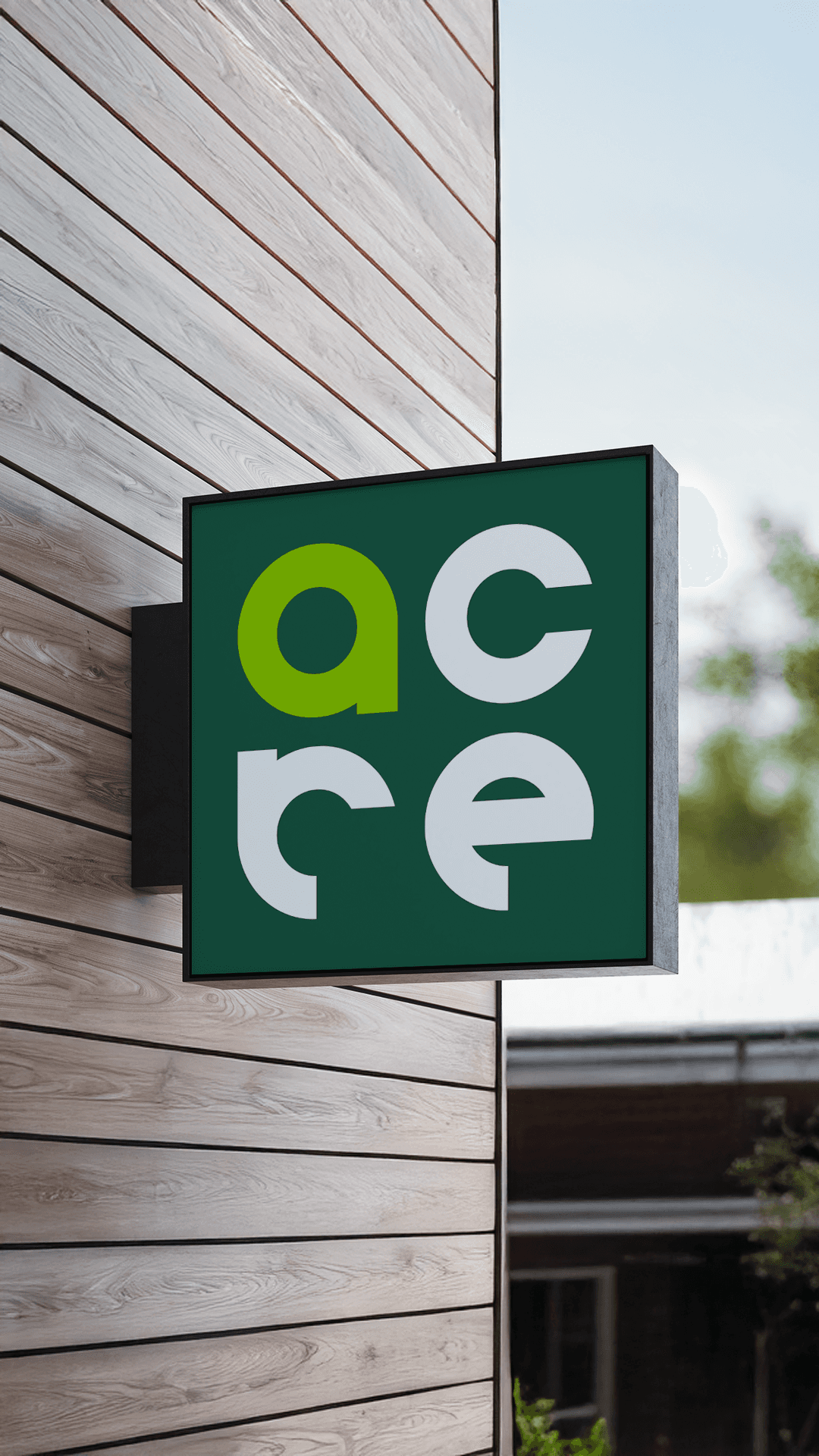
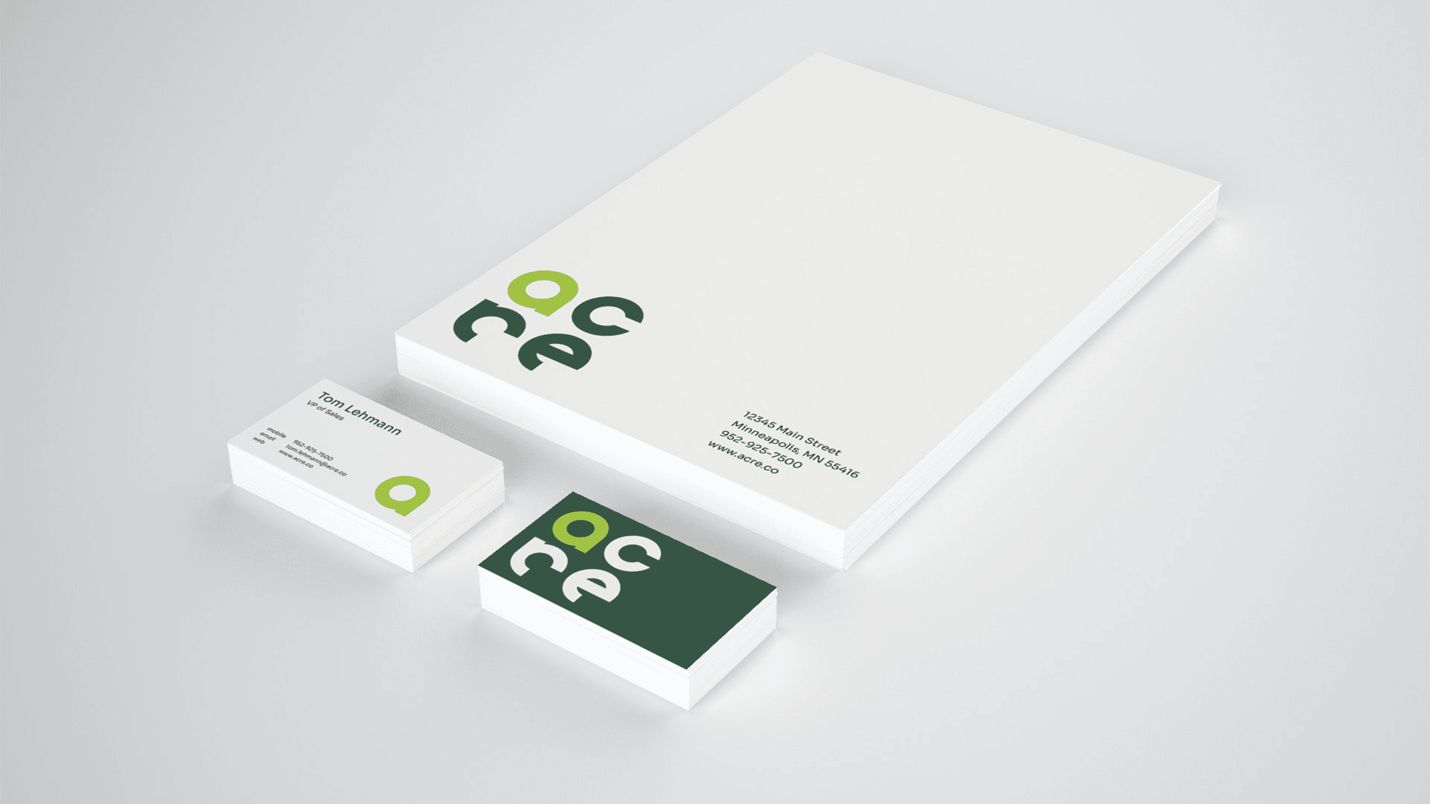
Execution
The execution phase brought the ACRE brand to life across a comprehensive range of applications. The geometric and modern aesthetic of the logo and selected typography echoed the contemporary architectural designs prevalent in the office spaces GOP helps create. To effectively communicate the brand's versatility and impact, a wide array of visual mockups was presented to the client. These included print collateral such as stationery and brochures, digital applications for desktop and mobile websites, aspirational magazine cover designs showcasing the brand in an industry context, and various signage applications demonstrating its real-world presence. This extensive presentation illustrated the adaptability and strength of the new ACRE brand identity across diverse touchpoints, ensuring a cohesive and impactful message.
Credits
Role
Art director
Agency
Devise
Client
General Office Products
Year
2022
Credits
Role
Art director
Agency
Devise
Client
General Office Products
Year
2022
Credits
Role
Art director
Agency
Devise
Client
General Office Products
Year
2022

JUSTINFREILER.COM
©2025 ALL RIGHTS RESERVED
JUSTINFREILER.COM
©2025 ALL RIGHTS RESERVED
JUSTINFREILER.COM
©2025 ALL RIGHTS RESERVED