

Oakley
The Science of Sight
Oakley
The Science of Sight
Oakley
The Science of Sight


This self-initiated concept project for Oakley Sunglasses aimed to elevate the brand's digital storytelling on both desktop and mobile platforms. The core objective was to create a more impactful and engaging online experience that highlighted the quality and style of Oakley eyewear. The design exploration focused on leveraging large, high-quality photography, impactful typography, and ample white space to create a visually striking and easily navigable environment, befitting a leading sunglasses brand.
Process
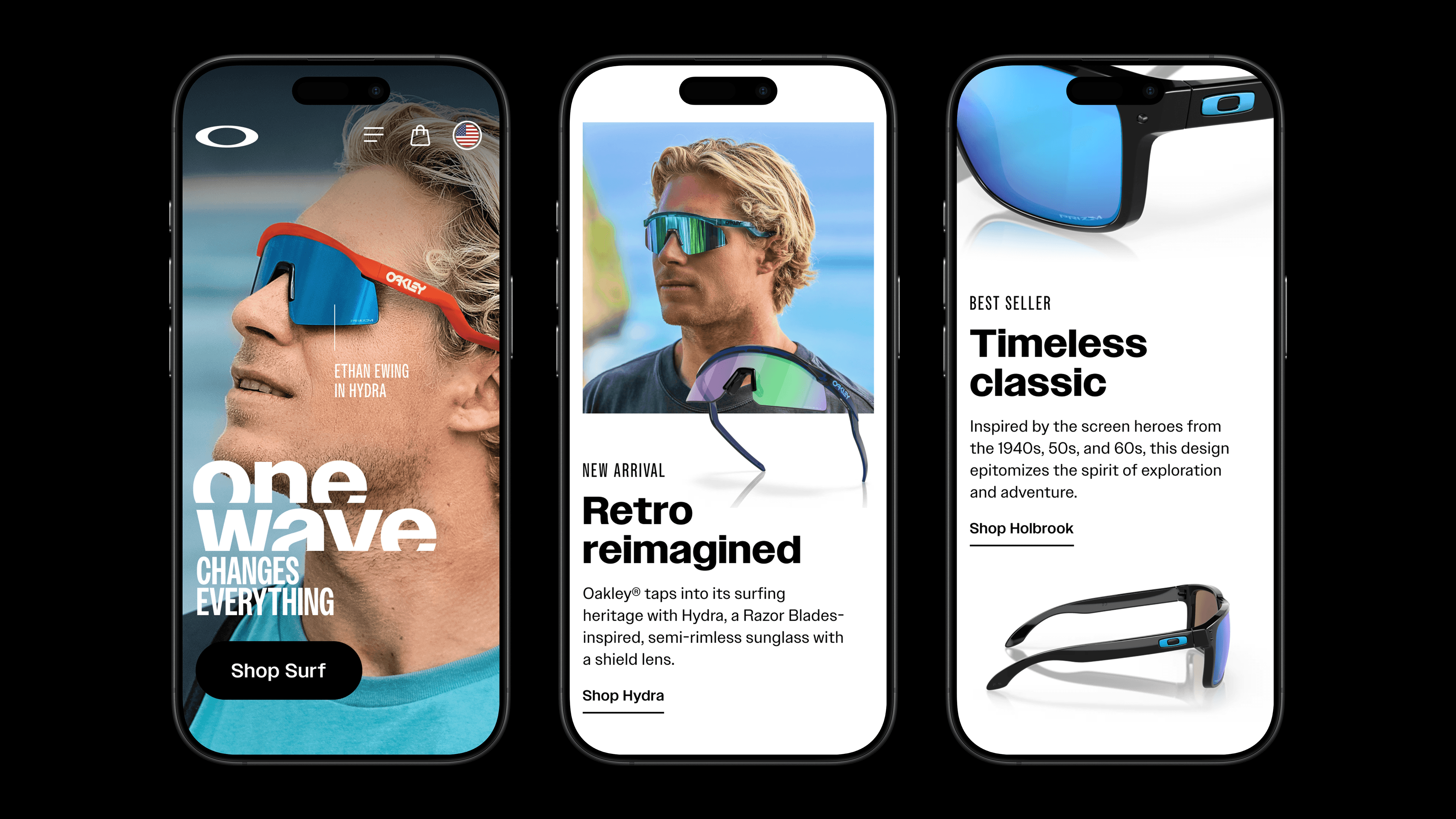
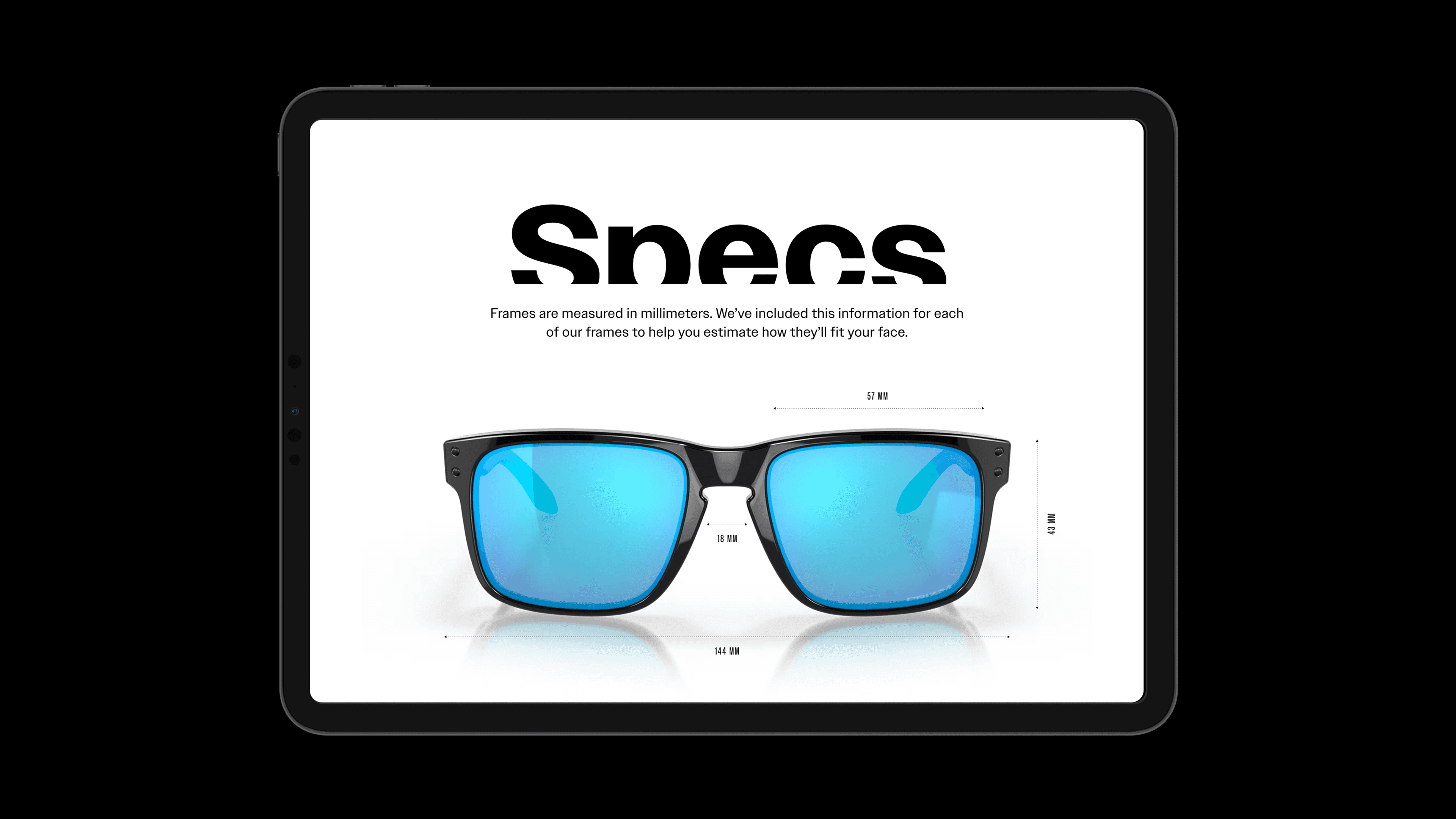
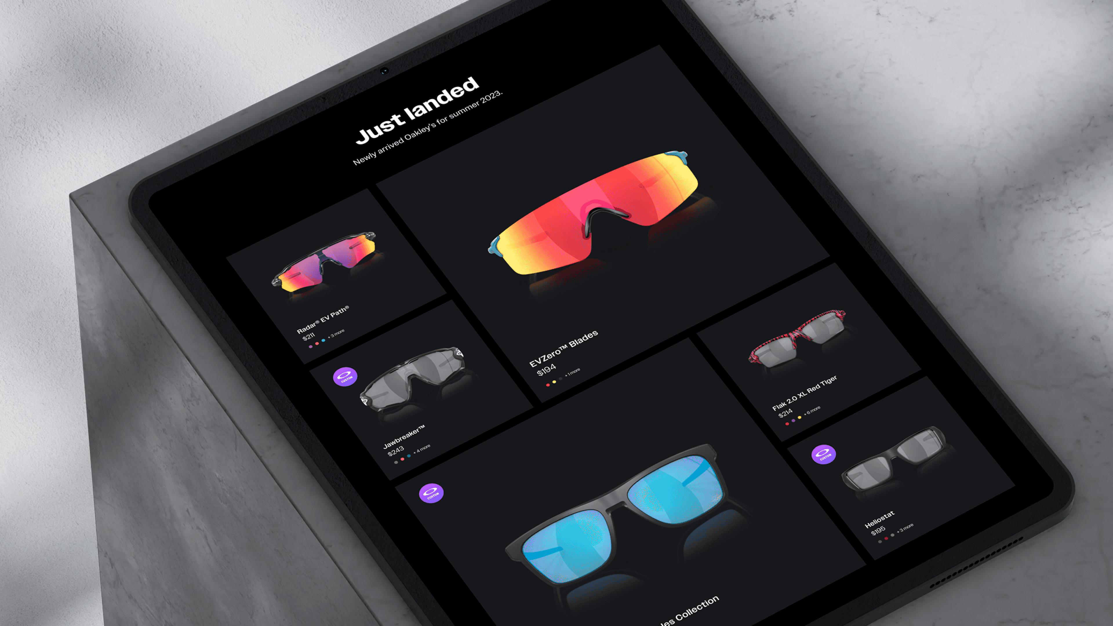
The design process for the Oakley concept centered around visual impact and clear legibility. Sharp, oversized product shots were strategically used to showcase the intricate details and quality of the sunglasses. These were juxtaposed with dynamic lifestyle imagery, often integrated within a parallax scrolling setting to create a sense of depth and immersion. An offsetting grid layout was employed to guide the user's eye naturally down the page, while interactive carousels were incorporated to add engaging elements and showcase multiple products or perspectives. A modern flair was introduced through a sharp cut detail applied to the typography. Vibrant accent colors, directly inspired by Oakley's diverse lens options, were used strategically to draw attention and reinforce brand identity. The exploration focused on designing both a compelling homepage and a detailed product page to demonstrate the potential of this elevated storytelling approach.
Process
The design process for the Oakley concept centered around visual impact and clear legibility. Sharp, oversized product shots were strategically used to showcase the intricate details and quality of the sunglasses. These were juxtaposed with dynamic lifestyle imagery, often integrated within a parallax scrolling setting to create a sense of depth and immersion. An offsetting grid layout was employed to guide the user's eye naturally down the page, while interactive carousels were incorporated to add engaging elements and showcase multiple products or perspectives. A modern flair was introduced through a sharp cut detail applied to the typography. Vibrant accent colors, directly inspired by Oakley's diverse lens options, were used strategically to draw attention and reinforce brand identity. The exploration focused on designing both a compelling homepage and a detailed product page to demonstrate the potential of this elevated storytelling approach.
Execution
The execution of the Oakley concept project resulted in visually arresting designs for both desktop and mobile interfaces. The homepage concept utilized expansive photography and bold typography to immediately capture the user's attention and convey the essence of the Oakley brand. The parallax scrolling effect seamlessly integrated product and lifestyle imagery, creating a dynamic and engaging browsing experience. The product detail page showcased individual sunglasses with large, detailed visuals, complemented by clear and concise information. Interactive carousels allowed users to explore different angles and features. The sharp typography treatment and vibrant lens-inspired colors added a contemporary edge to the overall aesthetic. The ample use of white space ensured that the product and key information remained the focal point, resulting in a clean, modern, and impactful digital experience that effectively communicated the quality and style of Oakley Sunglasses.
Credits
Role
Art Director
Agency
N/A
Client
N/A
Year
2023
Credits
Role
Art Director
Agency
N/A
Client
N/A
Year
2023
Credits
Role
Art Director
Agency
N/A
Client
N/A
Year
2023

JUSTINFREILER.COM
©2025 ALL RIGHTS RESERVED
JUSTINFREILER.COM
©2025 ALL RIGHTS RESERVED
JUSTINFREILER.COM
©2025 ALL RIGHTS RESERVED